

Does “Correlation” Really Mean “Causation”?
Ice cream sales and drowning incidents are statistically positively correlated. The more ice cream sold, the more drownings occur.
So, would banning ice cream sales reduce drownings?
Obviously not. A third variable – rising temperatures – is driving both. Correlation does not imply causation. Day 3 was all about experiencing this famous principle through actual data analysis.
Day 3’s Theme: Capturing Relationships in Equations
In Days 1 and 2, we learned how to decompose and visualize data. Day 3 took the next step: expressing the relationships between two or more variables as mathematical formulas.
Two approaches were introduced:
- Inductive approach: Discovering patterns from data (results) → correlation, scatter plots, regression analysis
- Deductive approach: Building models from theory (hypotheses) → modeling
Day 3 covered both in a single, intensive session.
The Inductive Approach: Scatter Plots, Correlation, and Regression
Scatter Plots: “Seeing” Relationships
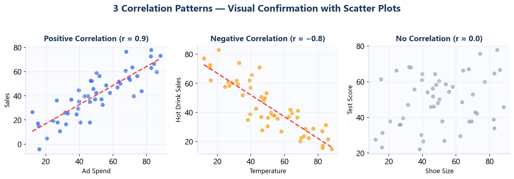
A scatter plot places two variables on the X and Y axes and plots each data point.
For example, to examine the relationship between “advertising spend (X)” and “revenue (Y),” you plot each month’s data on a scatter chart. If the points trend upward to the right, there’s likely a positive correlation. If they’re widely scattered, the relationship is weak.
The beauty of scatter plots is that they let you intuitively grasp data relationships without relying on formulas. Outliers and data clusters are visible at a glance, revealing patterns that numbers alone might miss.
Correlation Coefficient: Measuring the Strength
When a scatter plot suggests a relationship, the next step is to quantify that relationship’s strength using the correlation coefficient (r).
- r close to 1 → strong positive correlation
- r close to −1 → strong negative correlation
- r close to 0 → no correlation
A critical point emphasized in class: never rely on the correlation coefficient alone.
The famous “Anscombe’s Quartet” was presented – four datasets that all produce nearly identical correlation coefficients, yet look completely different when plotted as scatter diagrams. Some show linear relationships, others are curved, and one is distorted by a single outlier. Looking only at the numbers can lead you to fundamentally misunderstand the data.
This is precisely why you must always verify with a scatter plot alongside the coefficient.
Regression Analysis: Turning Relationships into Equations
Once a correlation is confirmed, regression analysis translates the relationship into a mathematical formula (regression equation).
y = a + bx (for simple regression)
With this equation, you can make quantitative predictions – for example, “If we increase advertising spend by $100,000, how much additional revenue can we expect?”
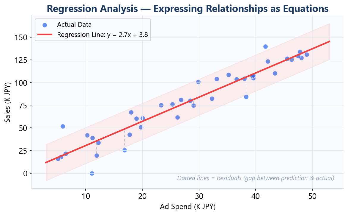
In class, we ran regression analysis in Excel using actual company sales data. By examining the coefficient of determination (R squared), we could see “what percentage of the data’s variation does this regression equation explain?” A high R squared indicates a good model fit; a low one suggests other significant factors are at play.
The Pitfalls of Regression Analysis
This brings us back to the opening theme. Even when regression analysis produces a relationship like “y = 50 + 3x between advertising spend and revenue,” this does not prove that increasing advertising spend will increase revenue.
Regression analysis reveals statistical association, not causal proof. The direction and mechanism of causation must be determined through business context and additional validation.
Failing to keep this distinction in mind creates a dangerous risk: presenting what the data doesn’t say as if the data said it.
The Deductive Approach: Modeling
The second half of Day 3 introduced modeling – an approach that captures business structure from the opposite direction of induction.
What Is Modeling?
Modeling means expressing the causal structure of a business as equations or tree diagrams.
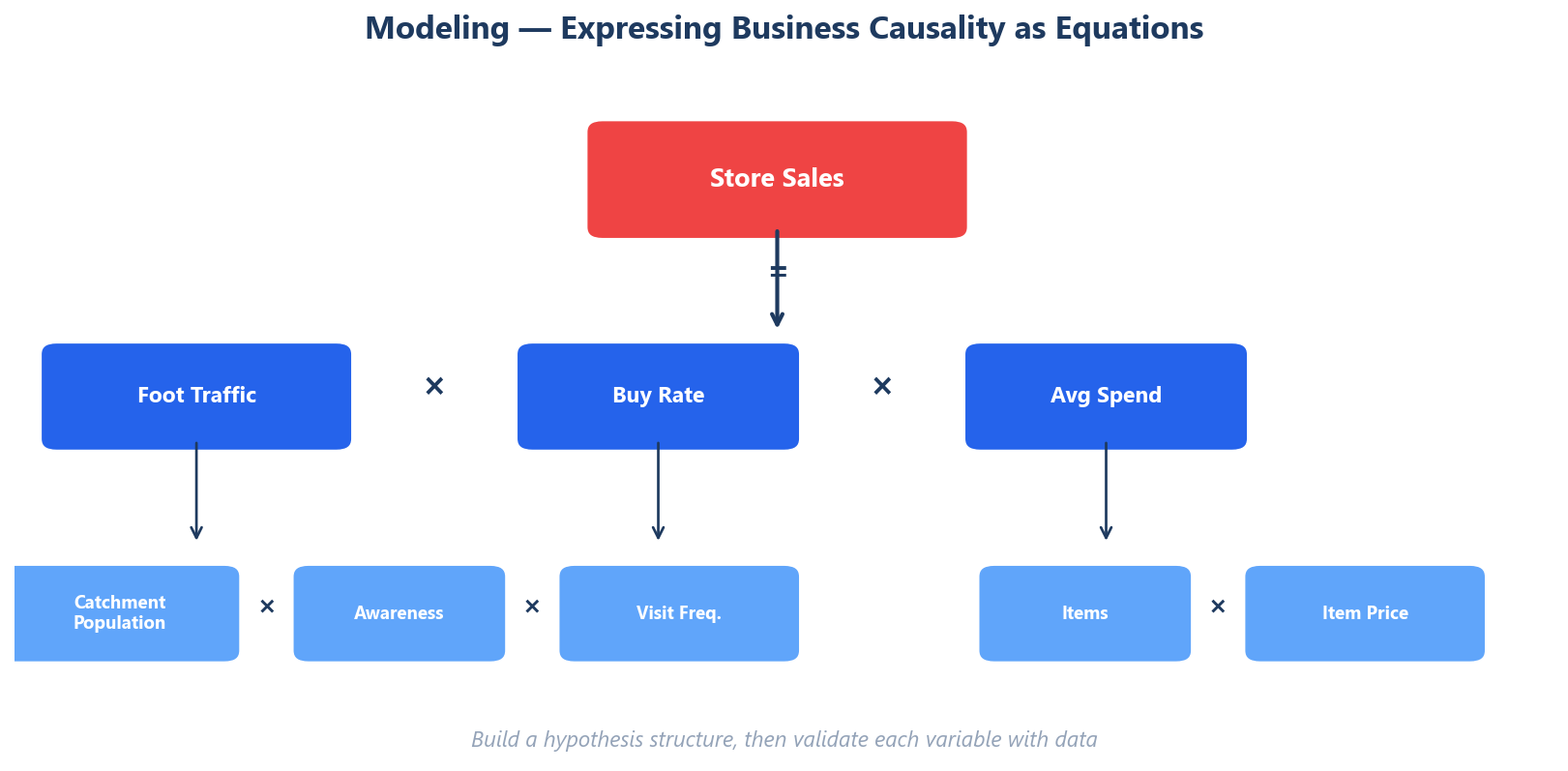
For example, modeling a convenience store’s revenue:
Revenue = Number of Visitors x Purchase Rate x Average Transaction Value
Breaking down the number of visitors further:
Number of Visitors = Trade Area Population x Awareness Rate x Visit Frequency
In this way, you logically construct “what structural factors fundamentally determine revenue.”
The Difference Between Induction and Deduction
The inductive approach (regression analysis) discovers relationships from data. When sufficient data is available, it can reveal connections between variables you hadn’t anticipated.
The deductive approach (modeling) builds structure from business logic. Even without data, you can construct a model from industry knowledge and logical reasoning.
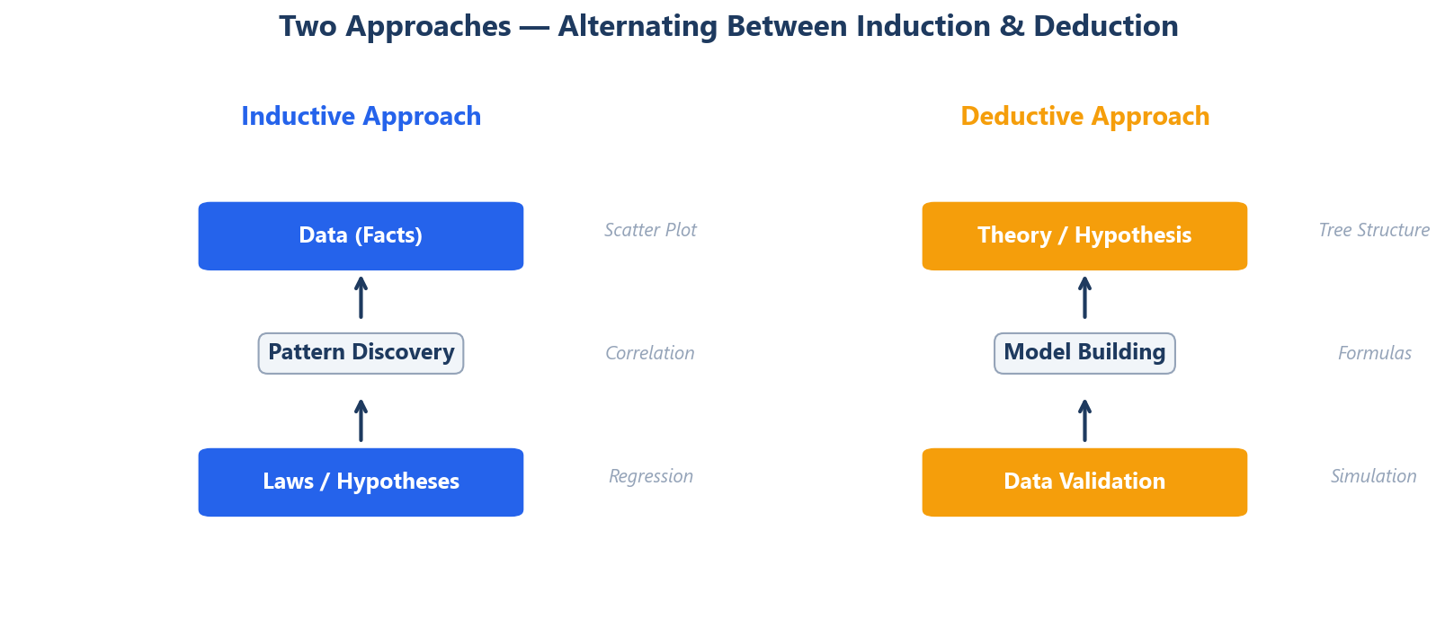
Neither is inherently superior. The key is to use both, alternating between them, to sharpen the accuracy of your analysis.
For instance, you might first use modeling to hypothesize “Revenue = A x B x C,” then use regression analysis to validate how much each variable A, B, and C actually affects revenue in the real data. If the model’s predictions don’t match the actual data, there may be missing variables in the model – and you iteratively update your hypothesis.
Business Applications of Modeling
Modeling isn’t just an academic exercise – it’s an extremely powerful tool in practice.
- Business planning: Simulate “how much improvement in which variable is needed to reach our target”
- Bottleneck identification: Determine which variable in the model has the greatest room for improvement
- Team communication: Visualize and share “this is the structure our business runs on”
In class, we practiced modeling using a coffee market case study, exploring how models can help estimate market size and analyze competitive dynamics.
Three Takeaways from Day 3
- Correlation and causation are different things. Even when regression analysis reveals a relationship, it doesn’t prove causation.
- Don’t just look at numbers – verify with scatter plots. As Anscombe’s Quartet teaches us, numbers alone can’t tell the whole story.
- Alternate between induction and deduction. You need both the ability to discover patterns from data and the ability to construct hypotheses from structure.
Day 3 was one of the most concept-dense sessions in the entire course. But because we had the foundation of Day 1’s “approach data with a hypothesis” and Day 2’s “pre-analysis preparation” and “visualization,” the concepts of regression analysis and modeling clicked smoothly into place.
Next up is Day 4: the comprehensive exercise. We’ll mobilize every technique learned so far to analyze a single case. The gap between “knowing” and “being able to use” will be felt acutely – but that’s a story for the next article.
Reference Books
– Naked Statistics by Charles Wheelan — Covers correlation vs. causation and regression analysis in plain language