

- 1 Is “0.9% Market Share” Really Small?
- 2 “Pre-Analysis Preparation” – What to Do Before You Start Analyzing
- 3 The Case: A Consumer Goods Company’s New Product Launch
- 4 “Seeing” Data – Four Visualization Techniques
- 5 Always Pair “Center” with “Spread”
- 6 Not “Which Chart Should I Use?” but “What Do I Want to Reveal?”
- 7 Three Takeaways from Day 2
Is “0.9% Market Share” Really Small?
This was the question posed at the very start of Day 2.
0.9% – at first glance, it seems negligibly small. But what if the market comprises tens of millions of units annually? Then 0.9% represents hundreds of thousands of units. At $1 per unit, that’s hundreds of thousands of dollars in revenue.
Judging by percentages alone is dangerous. Always make it a habit to check the actual numbers.
Day 2 opened with this powerful message.
“Pre-Analysis Preparation” – What to Do Before You Start Analyzing
In Day 1, we learned the fundamental principle of “starting from result decomposition.” Day 2 introduced what you need to do before you even start decomposing – what the course calls “pre-analysis preparation” (mae-sabaki).
Three Key Points of Pre-Analysis Preparation
Pause before jumping at eye-catching numbers. When looking at data, your eyes naturally gravitate toward dramatic changes or unfamiliar figures. But you can’t judge whether a number is truly important until you understand the bigger picture.
Percentages alone are dangerous – always check the actual figures. Metrics like market share and growth rates are convenient, but ignoring the base numbers leads to flawed conclusions. A threefold increase in market share sounds impressive, but if it means going from 100 units to 300 units, the business impact is minimal.
Start by decomposing actual result numbers. This is Day 1’s principle put into practice. Rather than immediately asking “Why?”, first establish exactly what is happening through the numbers.
An additional perspective was introduced: “Can you decide what NOT to look at?” When data is abundant, the temptation is to examine everything. But to boost analytical productivity, it’s effective to decide what to exclude first.
The Case: A Consumer Goods Company’s New Product Launch
The Day 2 case study centered on a multinational consumer goods company launching a premium soap brand in the Canadian market. Test market results were underwhelming, and the company faced a decision: should they proceed with a national rollout?
Converting Market Size into “Tangible Numbers”
The first exercise before diving into the case left a strong impression. The task: “Calculate the test market’s soap market size using the data from the case.”
The case materials contained scattered pieces of information – market share figures, revenue data, and other metrics. By combining them, we could calculate that “this market represents approximately X million units annually, and test market sales were approximately X thousand units.” Suddenly, the abstract “0.9% market share” transformed into “roughly 80,000 units” – a tangible, graspable figure.
Converting numbers into relatable units to build intuition. Whether or not you do this pre-analysis work makes an enormous difference in the accuracy of everything that follows.
Understanding Structure Through the Consumer Purchase Funnel
The case required us to analyze, using quantitative data, where in the consumer journey – awareness → interest → evaluation → trial → adoption – the problem lay.
We examined how each marketing initiative deployed in the test market (TV advertising, sample distribution, in-store promotions, etc.) was performing at each stage of the funnel. The data revealed patterns: awareness was high but trial rates were low, or trials were happening but repeat purchases weren’t following – and suddenly, the bottleneck could be precisely located.
The resulting strategic recommendations were not vague “let’s advertise more” directives, but targeted actions like “focus on driving trial” or “invest in retention programs” – interventions aimed at specific stages of the funnel.
This was the moment I truly experienced the practical application of Day 1’s principle: “decompose results to pinpoint problem areas.”
“Seeing” Data – Four Visualization Techniques
The second half of Day 2 covered data visualization methods systematically.
Histograms: Reading the Shape of Distribution
Histograms let you visually grasp how data is spread out. They reveal what averages alone cannot – the “shape” of the data: skewness, spread, and outliers become immediately apparent.
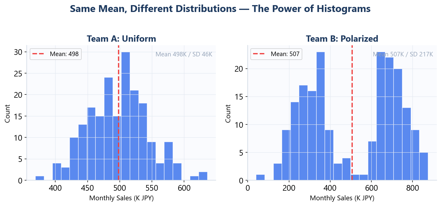
For instance, as shown above, when you plot monthly sales for two sales teams as histograms, you might find that both teams have nearly identical averages. But one team has everyone clustered between $40K and $60K, while the other is polarized between $10K and $100K+. The interventions required for each team would be completely different.
Pareto Charts: Identifying the Vital Few
This tool visualizes the Pareto Principle (the 80/20 rule). It helps you see structures like “80% of revenue comes from the top 20% of products” – distinguishing the “vital few” from the “trivial many.”
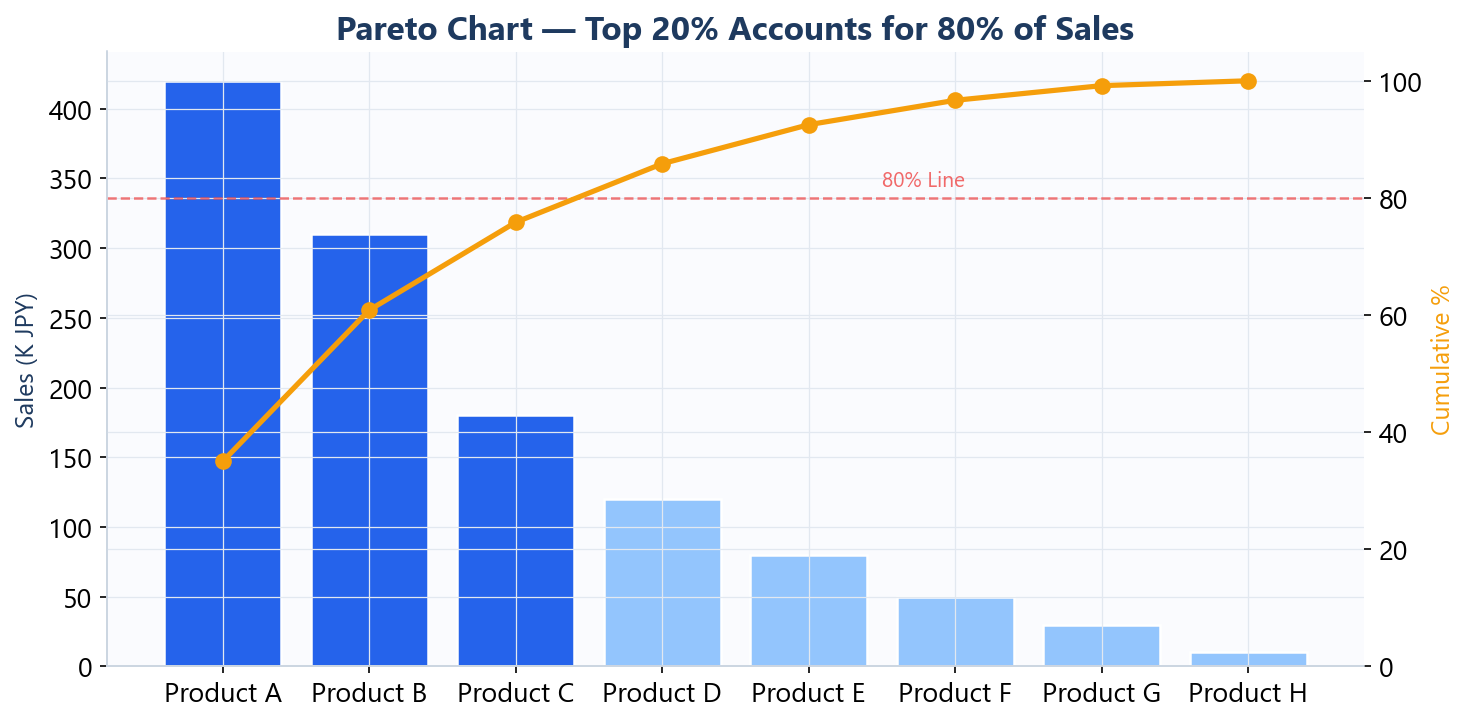
In improvement initiatives, tackling every problem equally is unrealistic. A Pareto chart lets you prioritize the highest-impact factors first, enabling more efficient improvement.
Waterfall Charts: Decomposing Drivers of Change
This chart shows the total change broken down by contributing factors in a cumulative format. When “revenue dropped by $2 million year-over-year,” it makes immediately clear which factors contributed how much.
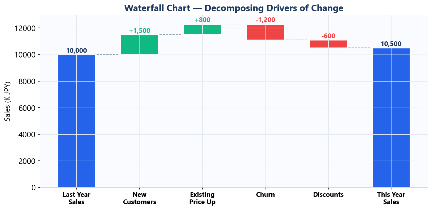
This is an extremely effective tool when explaining to an executive meeting “what drove results up or dragged them down.”
Time Series Analysis: Reading Trends and Seasonality
Plotting data along a time axis lets you distinguish between trends (long-term direction) and seasonality (cyclical fluctuations).
Whether “this month’s sales decline” is part of a long-term trend or a seasonal pattern that occurs every year at this time completely changes how you should respond.
Always Pair “Center” with “Spread”
Alongside visualization techniques, we learned about numerical summary statistics.
Measures of Central Tendency: Where Is the Center of the Data?
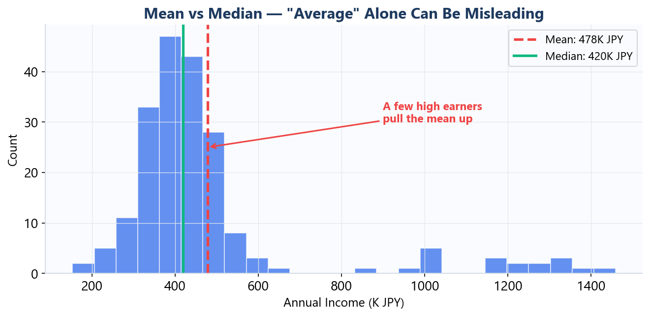
- Mean: Total of all values divided by count. Susceptible to outlier influence
- Median: The middle value. Robust against outliers
- Mode: The most frequently occurring value
When you hear “average income is $80,000,” it sounds high. But if a few extremely high earners are pulling the average up, the median might be $40,000. Judging the “overall picture” from the mean alone is dangerous.
Spread: How Much Does the Data Vary?
- Variance and Standard Deviation: Measures of how far data points are scattered from the mean
Two classes might both have an average test score of 70, but one class with a standard deviation of 5 (everyone scoring between 65 and 75) requires a completely different teaching approach than a class with a standard deviation of 20 (scores ranging from 30 to 100).
Always look at central tendency and spread together. This is the fundamental discipline for correctly understanding data.
Not “Which Chart Should I Use?” but “What Do I Want to Reveal?”
Every technique covered in Day 2 can be built using standard Excel features. No specialized statistical software or programming required.
But the important point isn’t memorizing how to create a histogram.
Only when you have a clear sense of purpose – “What am I trying to reveal with this analysis?” – can you choose the right visualization method. The method doesn’t come first; the question does. Day 1’s lesson of “approaching data with a hypothesis” remains consistent here.
Three Takeaways from Day 2
- Before judging by percentages, convert to actual numbers. Giving numbers tangible meaning improves analytical accuracy.
- Do your pre-analysis preparation before diving in. Decide what not to look at, decompose actual result numbers, then start.
- Always look at central tendency and spread together. The mean alone won’t reveal the true picture of your data.
What struck me after Day 2 is that while “data analysis” conjures images of sophisticated statistical techniques, in practice, it’s the pre-analysis stage – preparation and visualization – that determines the success or failure of quantitative analysis in the real world.
Next up, Day 3 dives into correlation, regression analysis, and modeling – methods for capturing the relationships between variables. I’m looking forward to seeing how the thinking frameworks from Days 1 and 2 come into play.
Reference Books
– Factfulness by Hans Rosling — A global bestseller on overcoming data biases, teaching how to see the world as it really is through numbers