

- 1 The “Staring at Data but Seeing Nothing” Problem
- 2 What Does “Analysis” Actually Mean?
- 3 Don’t Be Alice in Wonderland
- 4 Breaking Down Results – Building the “Main Road”
- 5 The Problem-Solving Thinking Steps
- 6 Insights from the Case Analysis
- 7 The Big Picture – A Roadmap for the Six-Day Course
- 8 Three Takeaways from Day 1
The “Staring at Data but Seeing Nothing” Problem
You’re in a meeting, flipping through a thick report full of sales trend charts and customer data tables. And then someone asks, “So, what’s the problem here?” Sound familiar?
The data is right in front of you, but you can’t figure out what it’s telling you. Or maybe you latch onto a number that catches your eye, start analyzing it, and end up with a resounding “So what?” at the finish line.
Day 1 of Globis MBA’s “Business Analytics” course was designed to break exactly this kind of “data paralysis.” The first lesson wasn’t about advanced statistical methods – it was about the mindset and thinking framework you need when facing data.
What Does “Analysis” Actually Mean?
The session opened with a deceptively simple question: what does the word “analysis” really mean?
In Japanese, the characters for “analysis” (分析) literally mean “to divide” and “to split apart.” Analysis is, at its core, the act of breaking things down.
And its purpose is to uncover cause-and-effect relationships – to clarify the connection between results and their causes.
The critical question here is: which do you start with? The answer is “results.”
Analysis begins by breaking down results. This was the foundational principle that ran through the entire session.
Don’t Be Alice in Wonderland
There are two fundamental approaches to working with data:
- “What can the data tell me?” – Exploring data to discover insights
- “What do I need to find in the data?” – Examining data with a hypothesis in mind
Neither approach is inherently wrong. But in the class, the emphasis was clear: in a business context, the latter – approaching data with a hypothesis – is essential.
The instructor referenced a passage from Alice in Wonderland. Alice asks the Cheshire Cat, “Which way should I go?” The Cat replies, “That depends on where you want to get to.” Alice says, “I don’t much care where.” And the Cat responds, “Then it doesn’t matter which way you go.”
Diving into a sea of data without a purpose or hypothesis puts you in Alice’s exact predicament. You get distracted by random numbers, your analysis goes in every direction, and you never reach a conclusion.
“What can I learn from this data?” versus “Can this hypothesis be supported by the data?” – just reframing the question this way dramatically changes the productivity of your analysis. That realization hit home for me.
Breaking Down Results – Building the “Main Road”
The Day 1 case study involved a B2B company facing declining sales.
In the first group discussion, most of us (myself included) jumped straight to asking “Why are sales declining?” We generated plenty of plausible hypotheses: “Maybe competitors are getting stronger,” “Maybe our sales team’s quality has dropped.”
But the instructor’s feedback was clear:
“It’s too early to hypothesize about causes. First, break down the result numbers.”
Split sales into “new customers” and “existing customers,” then further decompose into “opportunities,” “win rate,” and “deal size.” Suddenly, the data reveals exactly where the problem is concentrated.
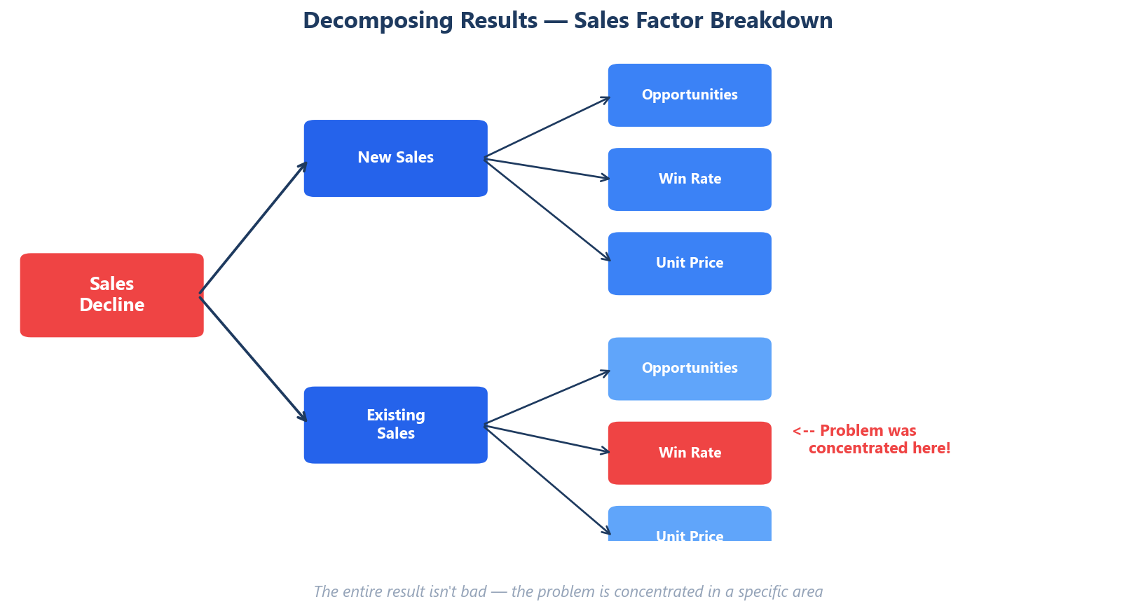 Only at this stage does it become meaningful to ask “Why?”
This approach was called “building the main road.” The diagram below summarizes the basic process.
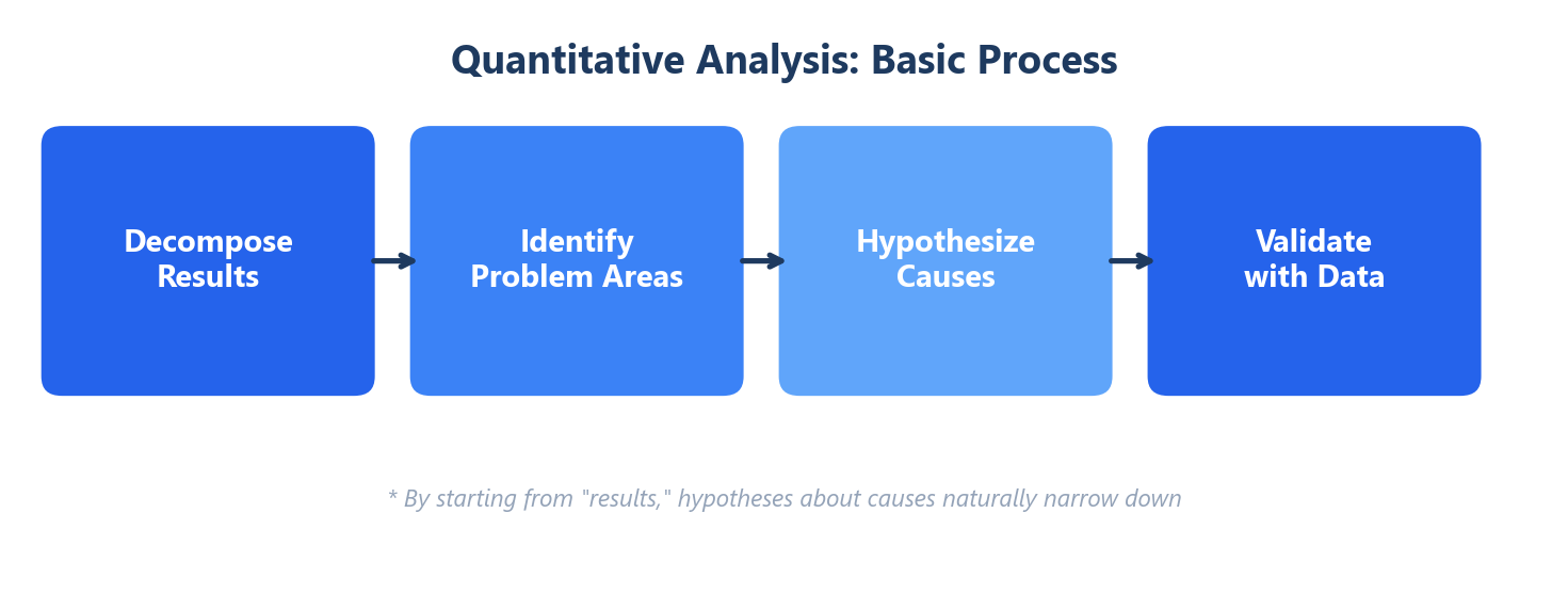
- Carefully decompose results to accurately understand what is happening
- Based on the facts uncovered, formulate hypotheses about causes (qualitative)
- Validate hypotheses with data (quantitative)
Result decomposition → Hypothesis building → Data validation. This sequence is the “main road” – the standard route for analysis.
If you jump to causes from the start, you risk cherry-picking data that confirms your preconceptions. By first decomposing results methodically, the hypotheses about causes naturally narrow themselves down. I truly understood why this sequence matters.
The Problem-Solving Thinking Steps
Through the case study, we also mapped out the overall process for quantitative analysis.
Step 1: Define the Gap Between the Ideal and Reality
The starting point of any analysis is problem definition. A problem is the gap between where you should be and where you actually are. If this is vague, you can’t determine what needs to be analyzed.
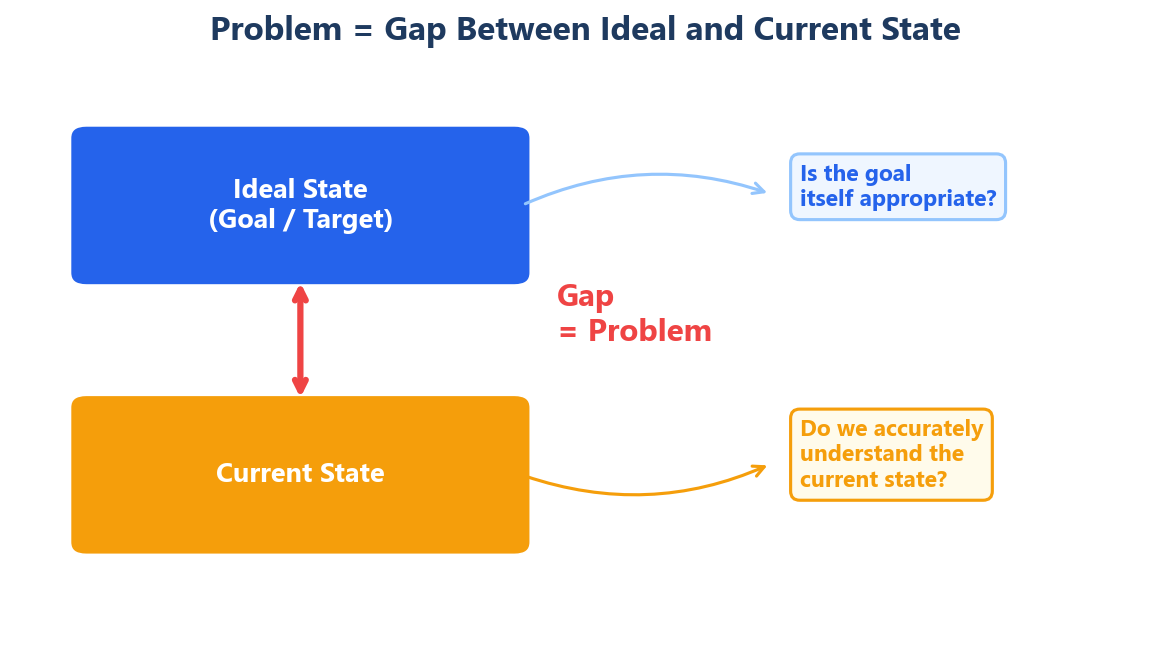
One insight that stuck with me: while it’s natural to focus on “reality falling short of the ideal,” we should also question whether the ideal itself is appropriate. If the target was unrealistically set, the root cause of the gap might not be “insufficient effort” but “flawed goal-setting.”
Step 2: Pinpoint Where the Problem Lives
Looking at aggregate numbers alone won’t tell you where to act. You need to decompose results and identify where problems are concentrated.
And the problem areas may not be limited to just one. Don’t stop at the first issue you find – verify through multiple angles.
Step 3: Dig Into the Causes
Once you’ve pinpointed the problem areas, dig into “why this is happening.” This is where you finally examine cause-side data – things like sales activity volume, marketing campaign effectiveness, and so on.
Step 4: Design Your Response
Based on the analysis, develop your action plan. The key here is to leverage the decomposition results. Instead of a vague “let’s try harder,” you target your interventions precisely at the problem areas your decomposition revealed, enabling efficient improvement.
Insights from the Case Analysis
When we actually worked through the Day 1 case in Excel, I experienced firsthand how powerful “starting from result decomposition” really is.
Data that initially appeared to show across-the-board decline revealed, when broken down by segment and time period, that the problems were actually concentrated in specific areas. Being able to say “this specific area is the issue” rather than “everything is bad” completely changes the precision of your response.
Another key takeaway: don’t rush to “what should we do?”
In business, there’s constant pressure to jump to “So, what’s the action plan?” But if you run with solutions before adequately decomposing the problem, you end up spending time and money on misguided initiatives.
Taking time to decompose may look like a detour, but it’s actually the shortest path. The instructor’s advice – “more haste, less speed” – really resonated.
The Big Picture – A Roadmap for the Six-Day Course
Day 1 also laid out the roadmap for the entire course:
| Day | Theme | What You Learn |
|---|---|---|
| Day 1 | The Purpose and Process of Analysis | Problem-solving thinking steps |
| Day 2 | Analytical Perspectives and Approaches | Histograms, Pareto charts, descriptive statistics |
| Day 3 | Analyzing Relationships | Scatter plots, correlation, regression analysis, modeling |
| Day 4 | Comprehensive Exercise | Applying all methods in practice |
| Day 5 | Decision-Making Under Uncertainty | Sensitivity analysis, decision trees |
| Day 6 | Analyzing Complex Causality | Multiple regression analysis |
The principles from Day 1 – “decompose results first” and “approach data with a hypothesis” – serve as the foundation for every method covered from Day 2 onward.
Three Takeaways from Day 1
- Analysis = breaking things down. To uncover cause-and-effect, start by decomposing results.
- Approach data with a hypothesis. To avoid being Alice, define your purpose and question first.
- Don’t jump to solutions. By channeling decomposition results into your action plan, you craft interventions that actually hit the mark.
These are simple principles, but if I’m honest, I haven’t always practiced them consistently. When I’m faced with data, I tend to latch onto numbers that catch my eye or rush toward “So what do we do?”
Day 1 was a wake-up call about my own thinking habits. Starting tomorrow, I’m going to make a point of asking myself: “What does that number look like when you break it down?”
Reference Books
– Naked Statistics by Charles Wheelan — An accessible, entertaining introduction to statistics that demystifies data analysis for non-experts